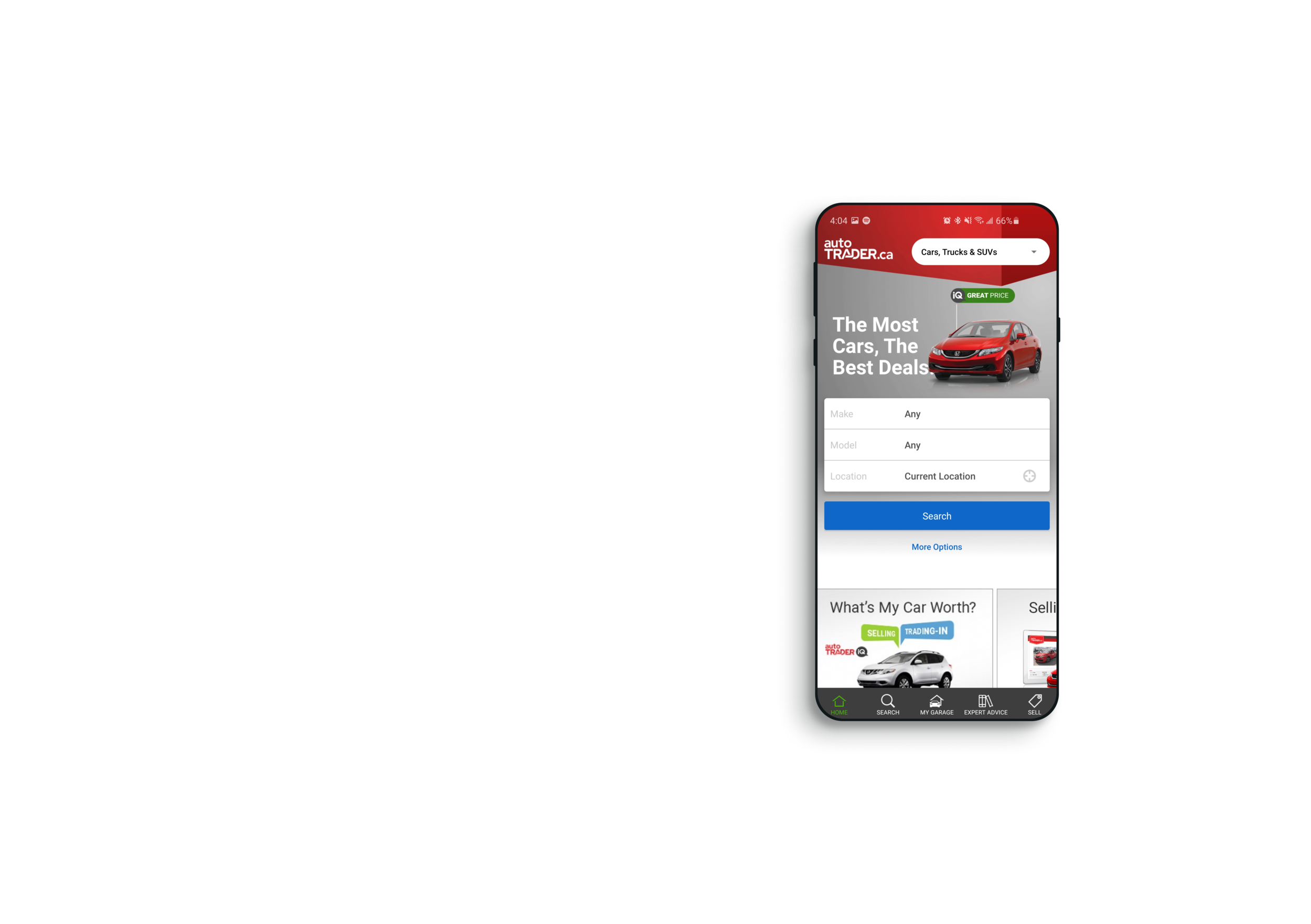
autoTRADER.ca
How do you brand for idea creation and brainstorming? Enter Quartz, a online community drive mindmapping web app.
The Opportunity & Challenge:
Responsive Web & Native Apps Product Design
April 2018 - July 2020
As a young boy waiting for my folks to finish up at the grocery store, I’d be nose-deep in the autoTRADER magazines dreaming of what it would be like to own one of those pretty classic cars.
Coming from a gearhead family, cars have always been a part of my interests. So when I received an opportunity to design for the household name, it was a no-brainer. autoTRADER.ca is one of Canada's largest IPs and helps millions of Canadians search for, sell, and buy all kinds of autos online.
During my 2+ years working full time here I had the pleasure to research, plan, test, and launch 100+ successful features and re-design on both responsive web and on iOS & Android form factors. As well as a new style guide system that changed how ideas become designs and the process of handing them off to the development teams.

This is just a taste, so I recommend you read the full Case Study!
Highlights
Transparency and the VDP
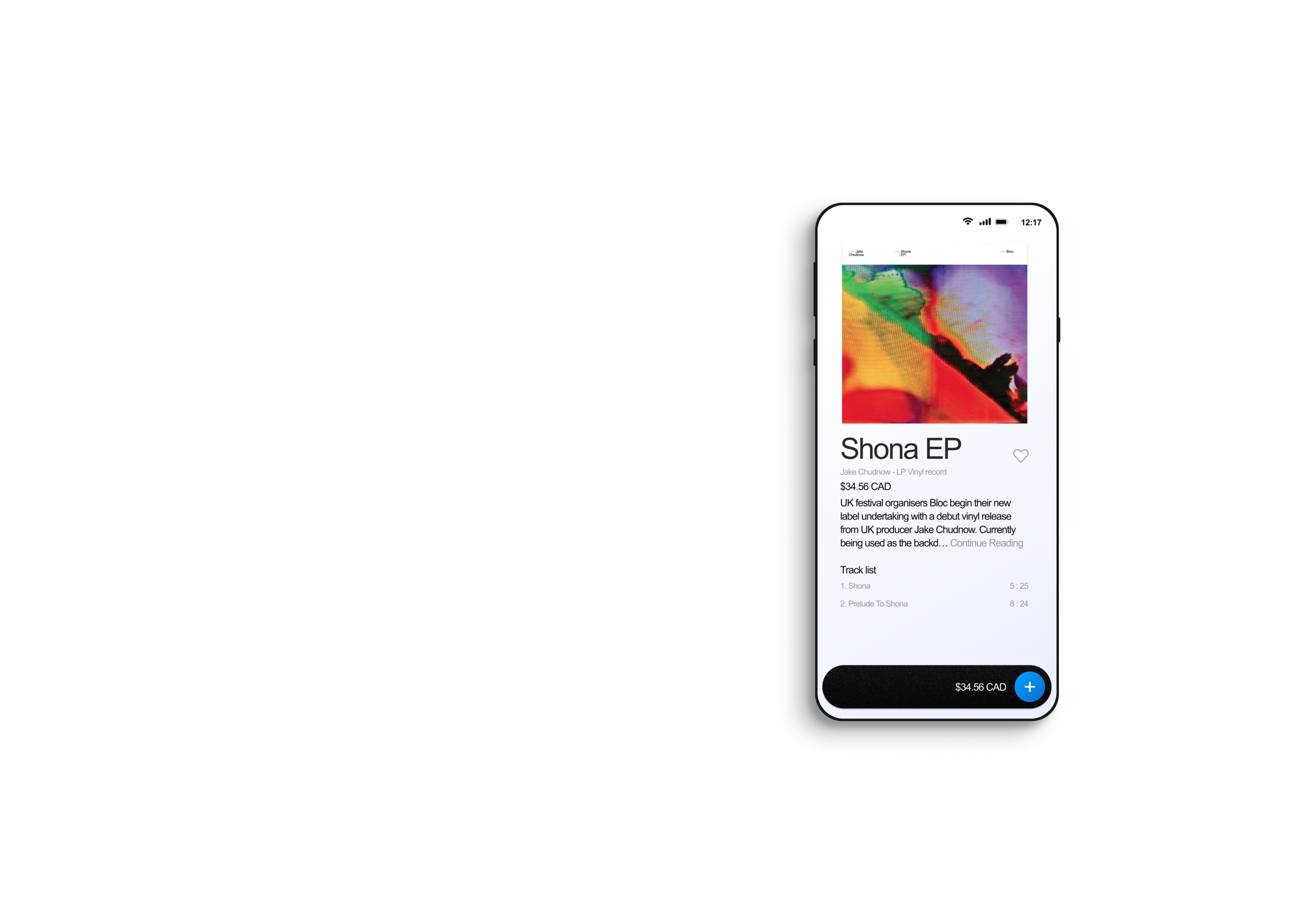
The Transparency Project to autoTRADER.ca is all about the consumer. Its MO was to empower the user with tools and information to make the best buying and selling decisions in our marketplace. Features like the iQ price badges indicate if the vehicle is a Great, Good, Fair, or Above average price in comparison to other vehicles in the same area and with a similar history. Or the condition analysis feature which takes into account the vehicle's mileage in comparison to similar listings on our marketplace and another point of interest such as how many owners it had or if it had been in an accident or not.
My assignment to the Transparency project was to optimize all the different features associated with it for customer and business success. The place to find the majority of Transparency features is the VDP. The VDP (Vehicle Display Page) was the crown jewel of my time at autoTRADER.ca.
Here is a comparison of what The VDP looked like when I started VS the time I left:

The CUT re-design
The most difficult and most rewarding project I had the privilege of working on was nicknamed CUT, the Consumer UX Transformation. It first started with a concept full redesign of the app made by a fellow designer. Once the project got legs I was asked to join in because of my work on the “Vehicle Details Page”.
We were to start on a new VDP and rework all styles, buttons, logic, and anything else the user/consumer would interact with. When we had made the design fully and user-tested an MVP on the app, we would then translate the designs to a responsive web then continue to MVT the design and optimize. With the success of the redesign, our new CUT style was the newly adopted design system for the entire company. Together we created this system owes credit to our handoff procedure and expressive allowance to try new ideas.
There are a lot of secret NDA secure differences that I cannot discuss here. However, these are some of the key differences we created from the original VDP to the CUT VDP re-design:

Our main goal of this re-design was to reduce the number of different styles and CTA’s on the page to drive click-through rates and understanding of the page. Our running hypothesis was that if the user has less varied text styles, button styles, and a reimagined page architecture, our users would be able to find what they are looking for and use the products and lead-generating CTA’s.
There were 8 different CTA’s a user could interact with on the original design. Our re-design aimed to limit that down to 3, A lead generating CTA, a CTA to interact with a card, and a CTA to save the listing for later. The hypothesis was that making fewer choices and differences for the users would lead to a simpler experience and better KPI metrics for our business needs. A win-win situation.
We found this system to work because of the testing we did. It confirmed that users could navigate the page and interact with the things that matter to them because they weren't confused or trying to understand why the interactions were different from one content block to the next content block.

Animation Prototyping
I was asked to create concept animations that would help illustrate how a page should animate.
This is how I imagined the desktop VDP would interact when a user scrolled down the page. Without concepts like this, a developer has to assume how the page feels which makes it a lot more difficult for them. So animations like this really made a big difference in the speed at which the project can be completed and the final feeling of the experience.
There are multiple moving parts here. The sticky top bar, the sticky lead form on the right, and the main body of the page. The idea of this concept was to have the ads on the page receive their initial loading metrics and then move out of the way. This is because, after a certain amount of time, we wouldn't need to have them displayed anymore to have them as a successful ad, and the user sentiment towards ads was poor. This idea was meant to be a win-win situation.

Another micro-interaction that I was asked to explore was the home screen on the Native apps. We had an opportunity to bring character and context to the experience by changing hero images based on the user’s search criteria.
The default experience is the passenger vehicles homepage with a red Honda Civic, if the users wish to change their search to Motorcycles or boats, etc. they select the category with the drop-down on the top right. The problem is that the home page would still show that Honda Civic as the hero image and that is no longer relevant to the type of content the user is searching for.
We saw an opportunity here to both give a contextual experience to the users and sell the “Hero slot” on the homepage to different manufacturers. It was my job to present ideas on how the experience could take advantage of this opportunity.
Projects like this made it truly a blast to work at autoTRADER.ca!
This is just a taste, so I recommend you read the full Case Study!