YELL
Whisper to a Shout, the team and I had three weeks re-design the weyell.org website for web and mobile use.
The Opportunity & Challenge:
Responsive Web. UX Project
November 2016
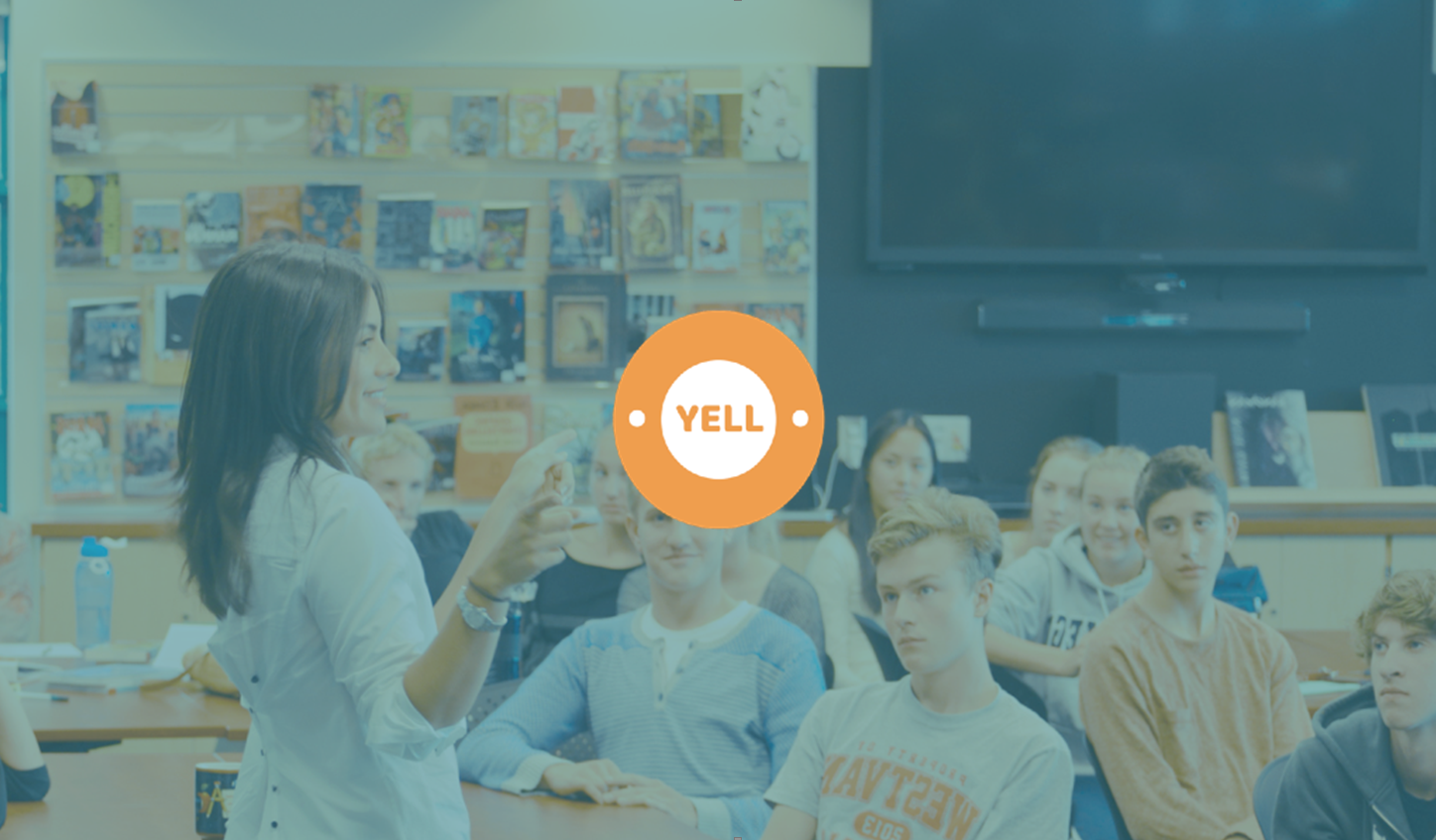
YELL is the young entrepreneurial leadership launchpad. It's a curriculum that is implemented into Vancouver public schools with hopes of stretching across Canada. Its previous web presence was made in haste and was lacking quality. The team and I had three weeks re-design the weyell.org website for web and mobile use.
From the get-go we knew our design must allow all users to gain access to forms and details relating to their needs. Help develop the website as a tool for the YELL staff to manage applicants and requests. Create a new feeling of energy and excitement for the brand and the entrepreneurial mindset, while being attractive on any screen.
Project Highlights
User Data
And we were off! We dove into our research phase and immediately were faced with some major challenges. One being access to our eventual end users. Seeing our domain was in education and sponsorship, not every user was able to talk us due to their status as a minor and our lack of time to complete a security background check. Although this held us back we still gathered a sizeable amount of data by reaching out to your own networks within the domain. Alongside the interviews, we created a survey and sent it to high school students on Reddit. Then analyzed the essence of competing organization and comparing them to YELL.


Deliverables
We tackled the responsive design goal by choosing to design mobile first. The mentality here is if the product works and looks great on a smaller screen it will be even better when there is more space to work with on a larger scale. Progressive development over graceful degradation.
Desktop Before
Desktop After
This is just a taste, so I recommend you read the full Case Study!